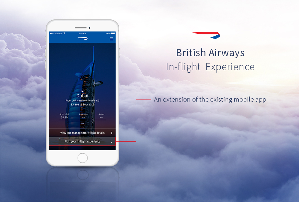
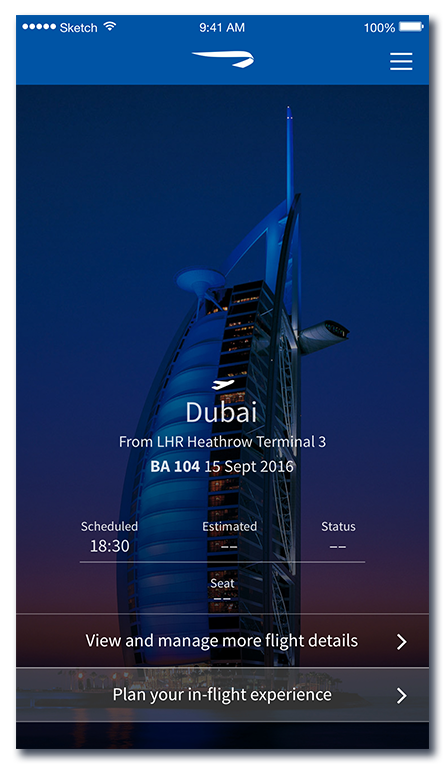
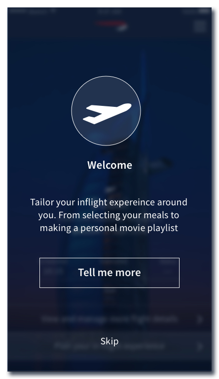
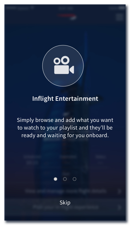
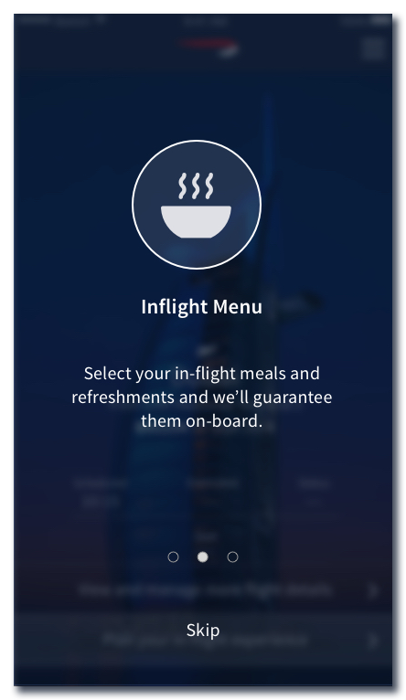
BA in-flight Experience mobile app extension
ROLE: UX, UI & VISUAL DESIGNER
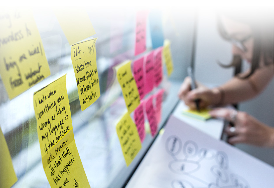
Target User definition and Feature prioritization by means of User Research (interviews & surveys). Conceived interaction Design on White board, paper, interactive as well as animated Prototypes. Run usability walkthroughs with end-users
TOOLS & METHODOLOGIES
Scrum, Interviews und Surveys, Design studio, creation of personas and scenarios, A/B Testing, pen & paper, white boards, Google forms, Invision, Principle, Sketch, After Effects, Photoshop & Illustrator
SHORT DESCRIPTION
This project aimed at improving British Airways’ inflight experience by extending their existing mobile app functionality, as well as the in-flight entertainment system on board
User Research
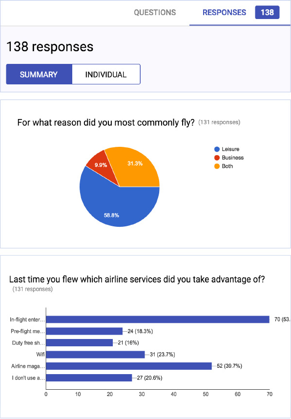
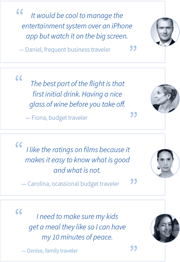
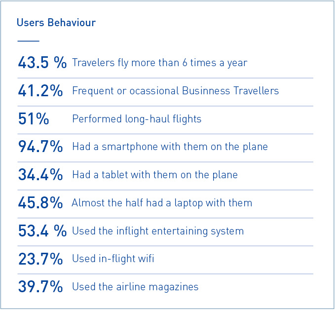
To evaluate the potential of extending the services offered in-flight, categorized users into user groups. This was done using a serie of interviews and an online survey of 138 participants.
![]()
Outcomes
![]()
User Types
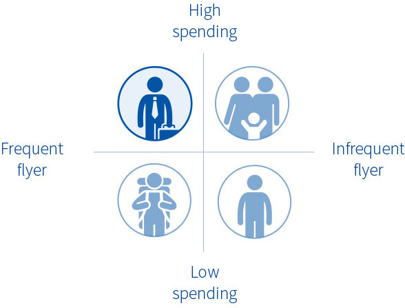
Based on Market & User Research, we identified 4 primary user types: • Business travelers • Family travelers • Budget travelers • Non-travelers
![]()
Target User
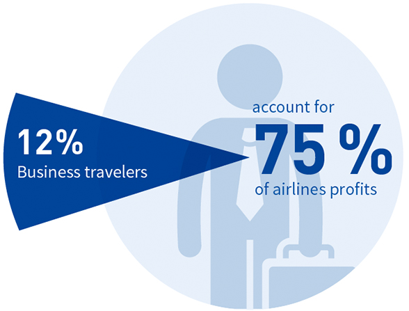
Because customers flying on business are by far the most profitable (and most important for BA to retain), we selected the Business Travelers as the target user group for this study.
Feature prioritization
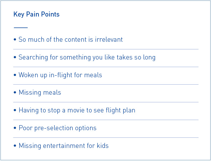
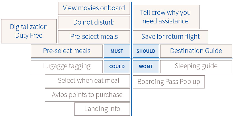
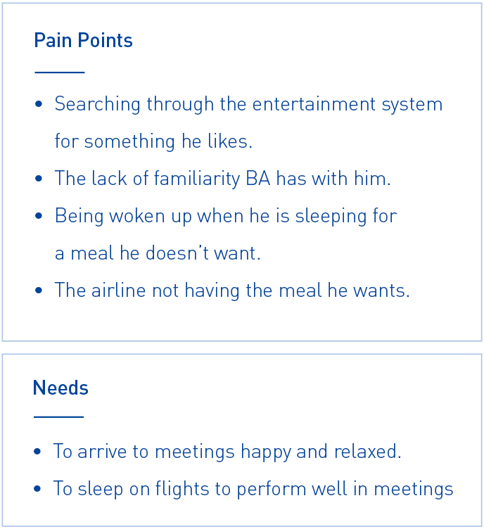
Our research revealed several common “pain points” in their flying experience. We decide to add functions to the app that would address these concerns, prioritizing those that could be easily integrated into the existing app after a two-week development sprint.
Solution BA In-flight Experience
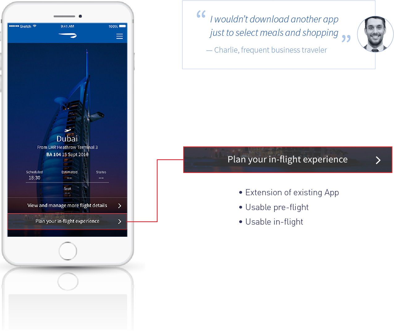
We decided to improve BA’s inflight experience by extending their existing mobile app. We specifically did not want to create a new, standalone app because customers should not have to install more than one BA app, and because the number and nature of new features did not demand their own application. The new, extended BA app would be useful pre-flight, but would also interact with the onboard entertainment system during flight, providing a seamless experience.
Personas and scenarios
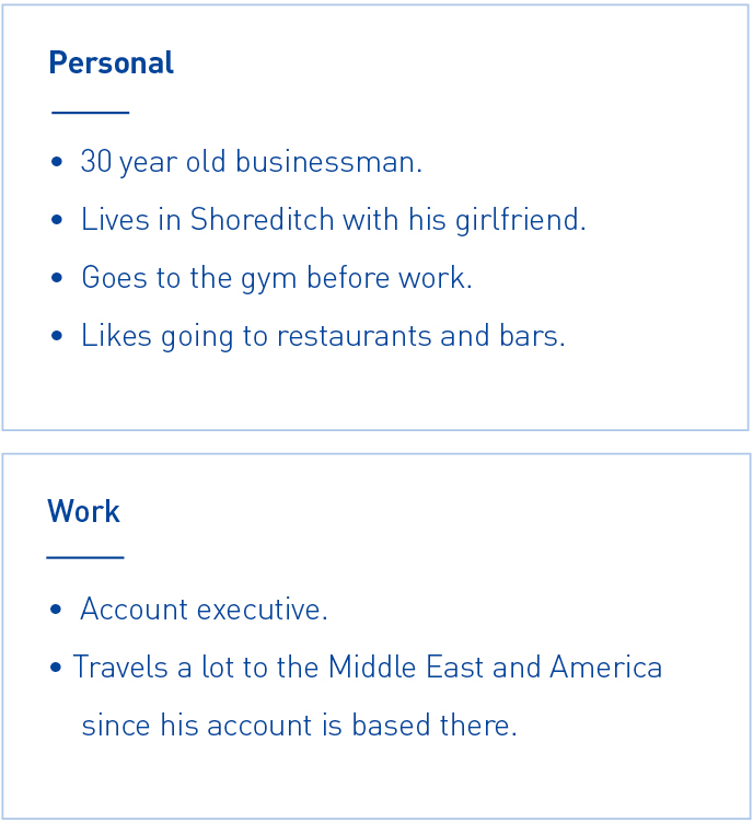
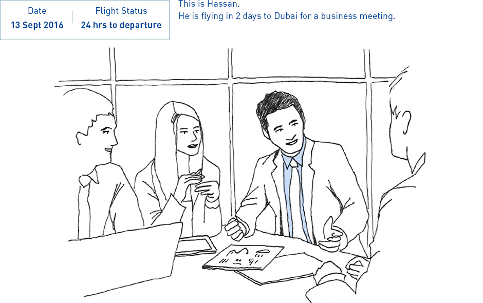
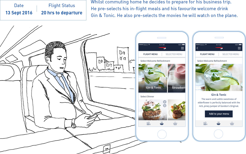
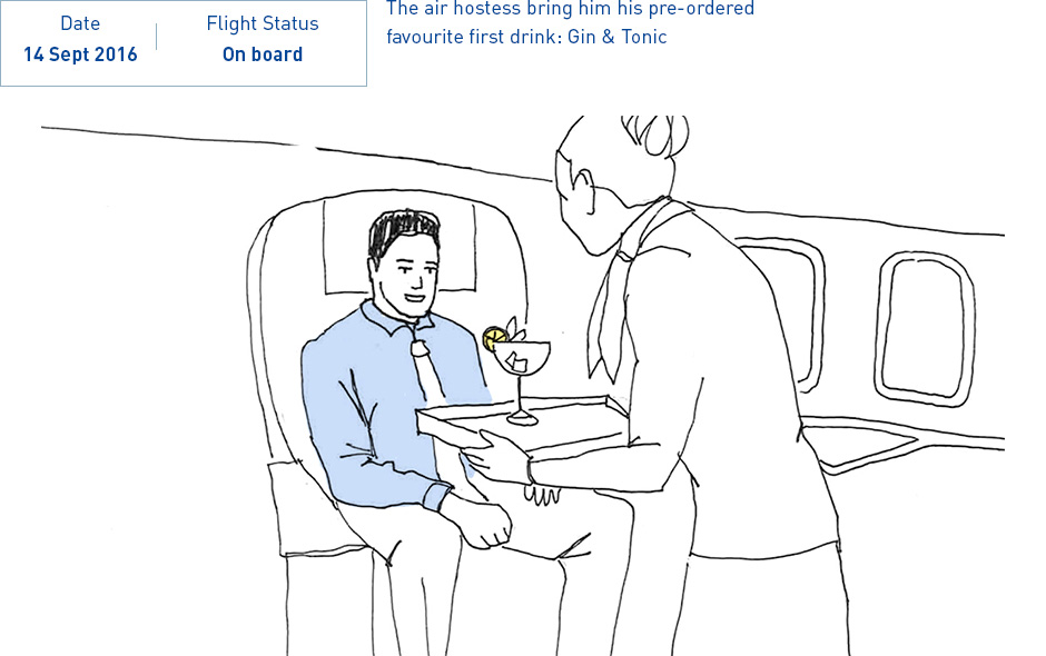
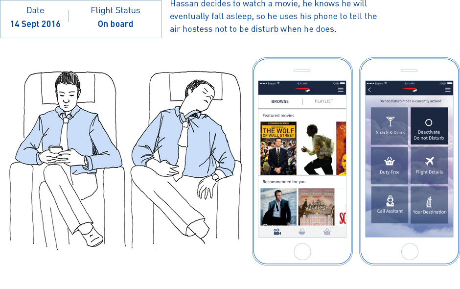
I fly so often on the same routes with exactly the same crew that you think they would know what I want to drink by now.
— Hassan Karim
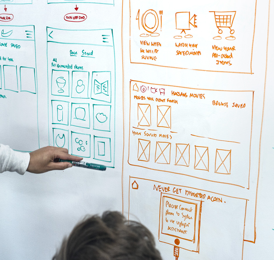
First Prototypes / Wireframes
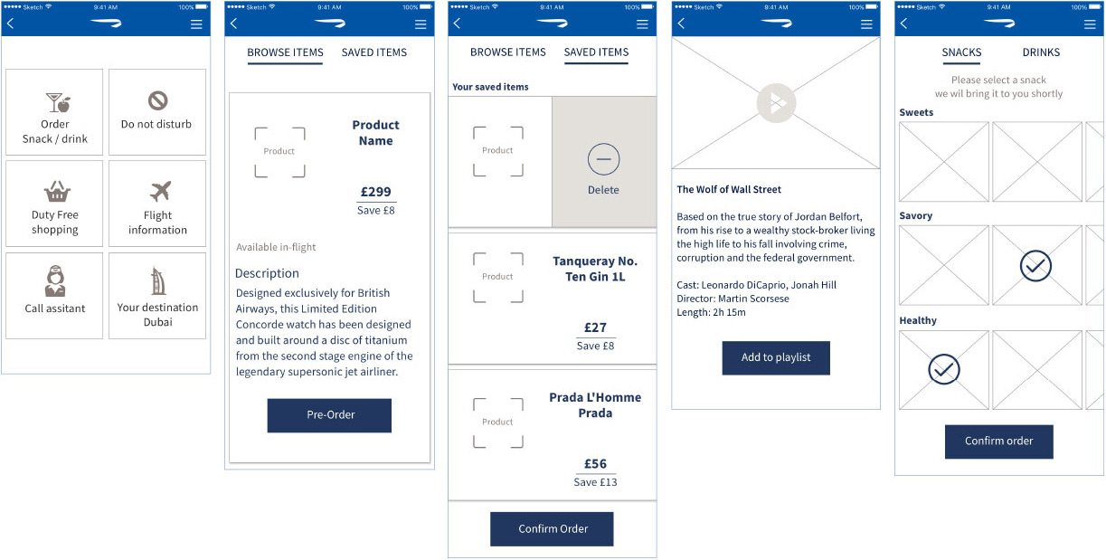
Screen / user flows
The goal was to create user flows that are simple and intuitive. We accomplished this by building in consistency with the existing app’s most popular features. These features have user flows that do not exceed eight steps from start to finish
![]()
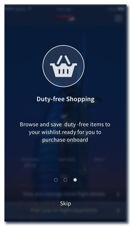
On boarding
![]()
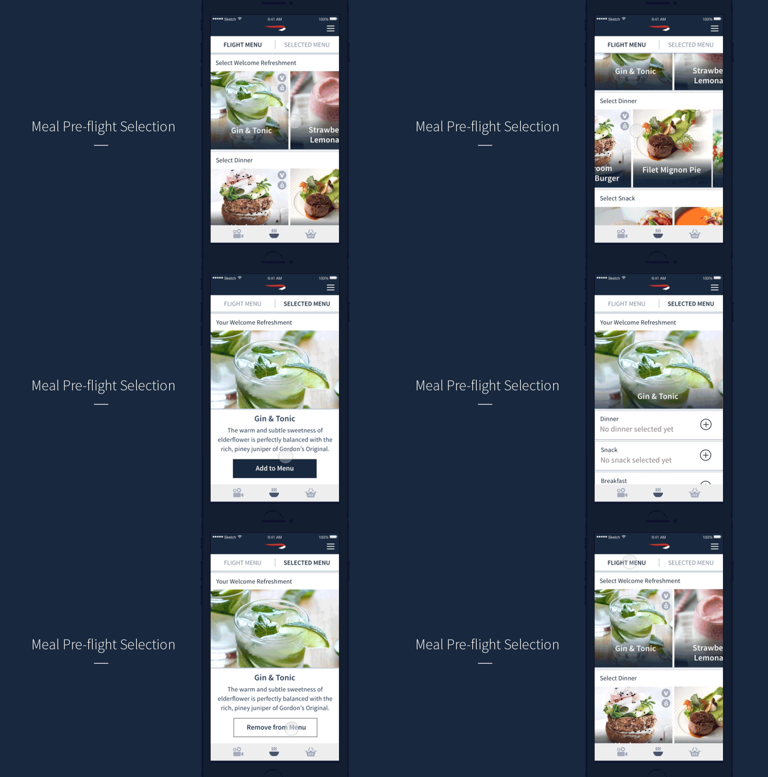
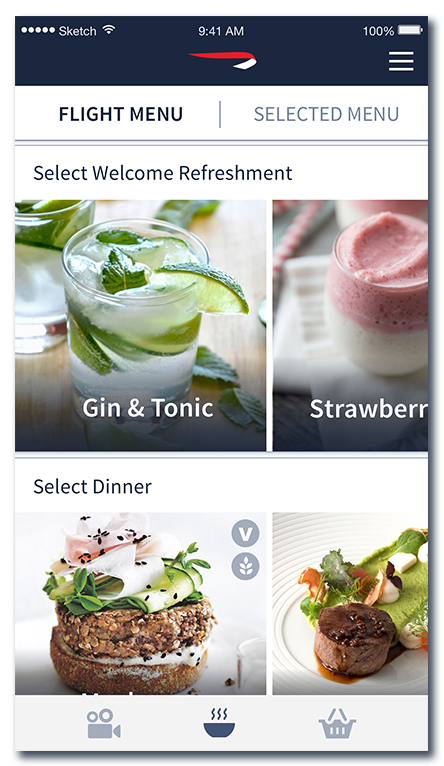
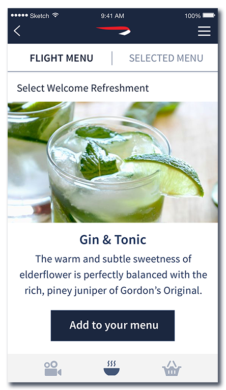
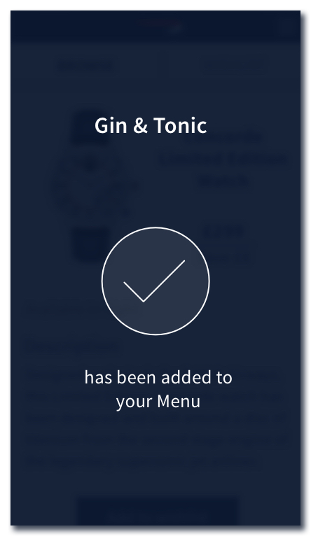
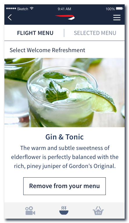
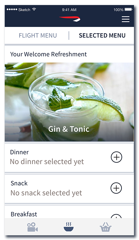
Meal pre-flight Selection
![]()
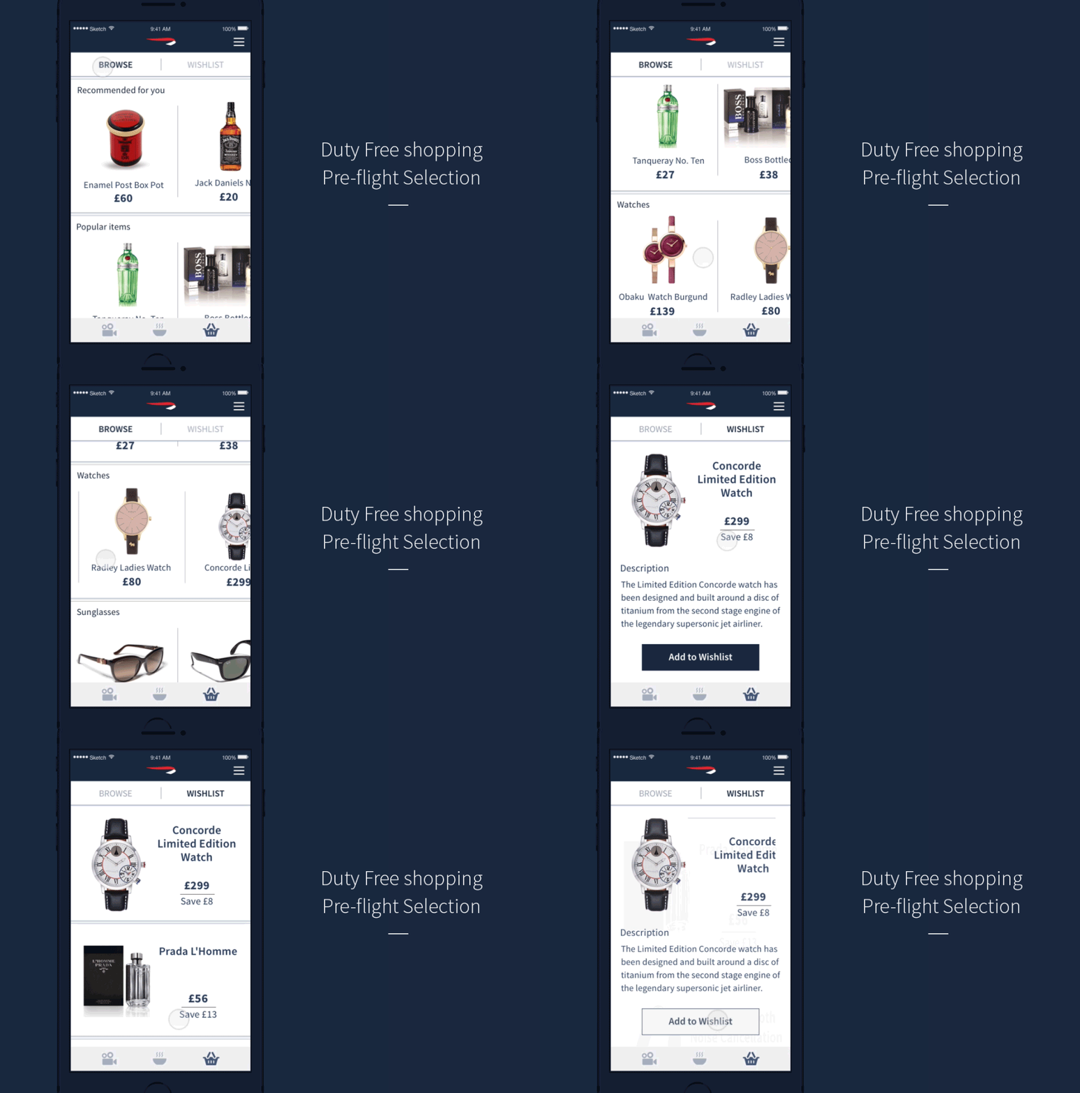
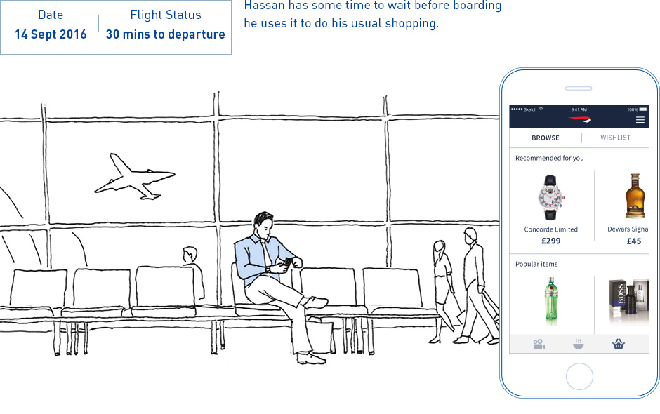
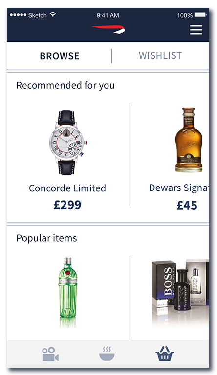
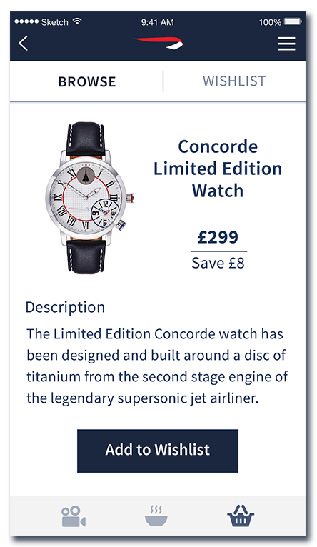
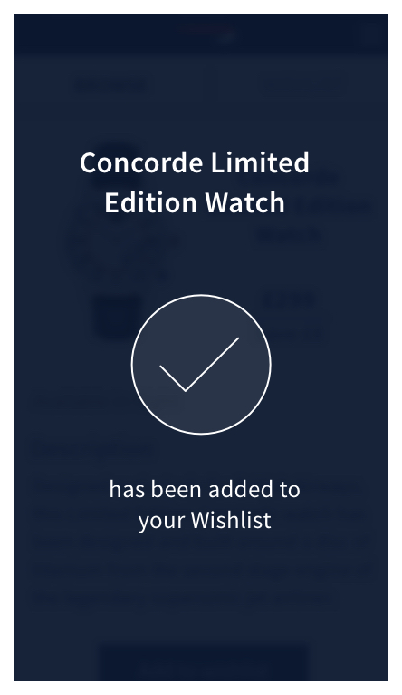
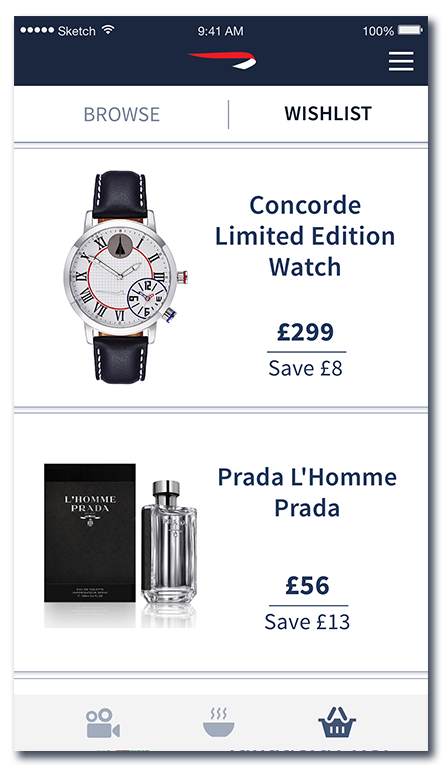
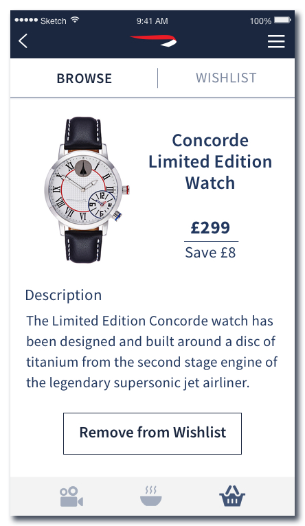
Duty free pre-flight Selection
![]()
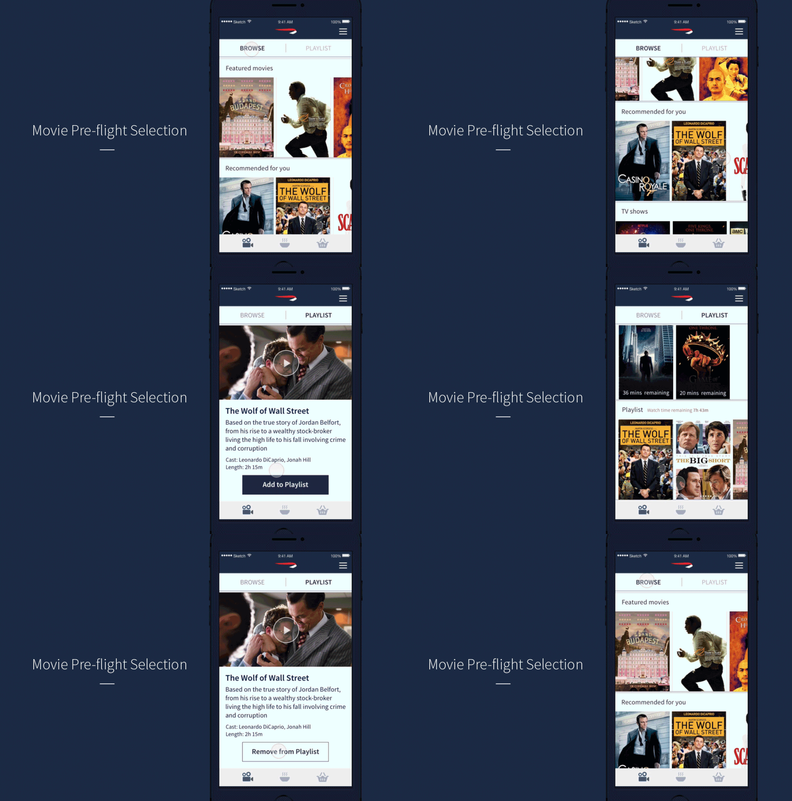
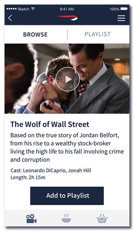
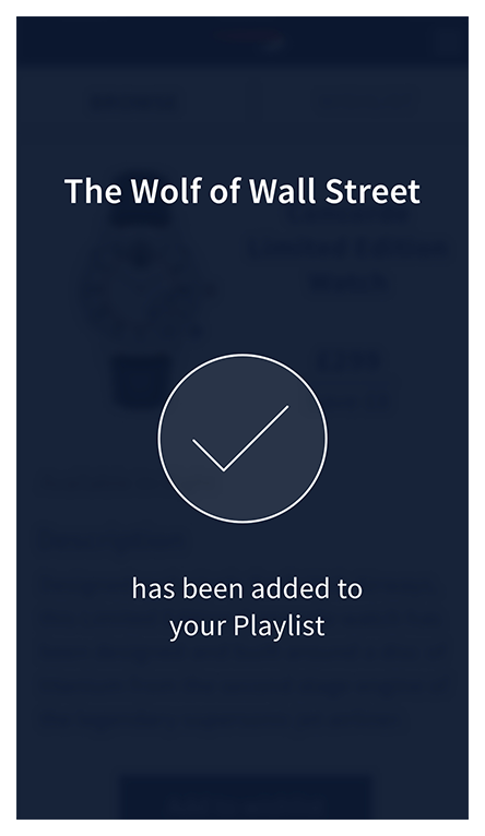
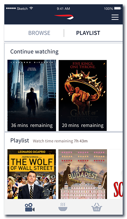
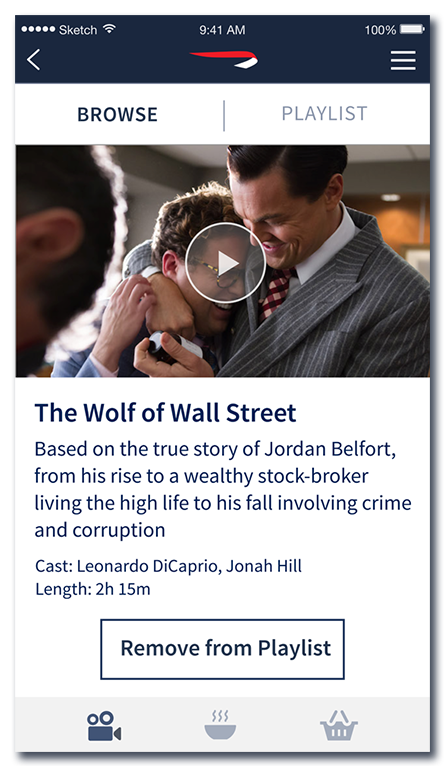
Movie pre-flight Selection
![]()
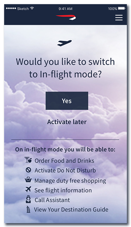
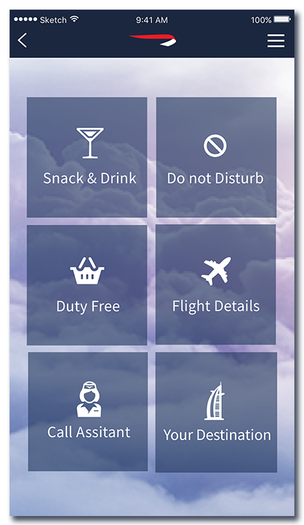
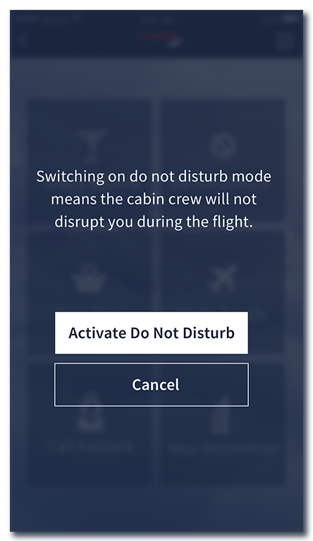
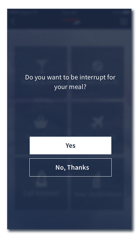
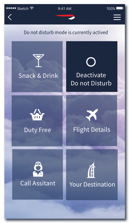
App in-flight Mode: Do not disturb
![]()
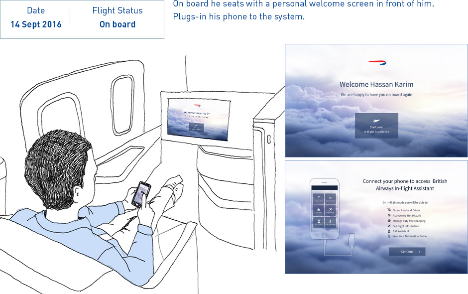
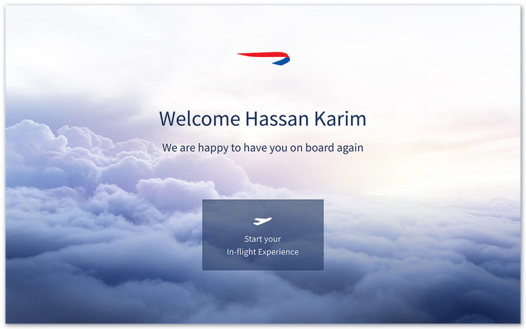
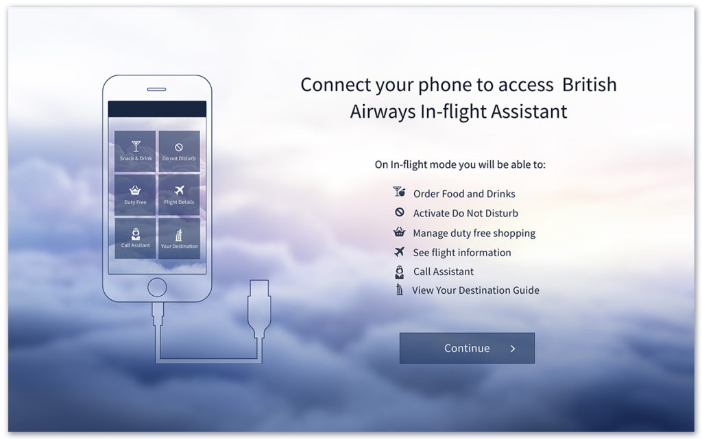
On board: Welcome & connect phone to the system
